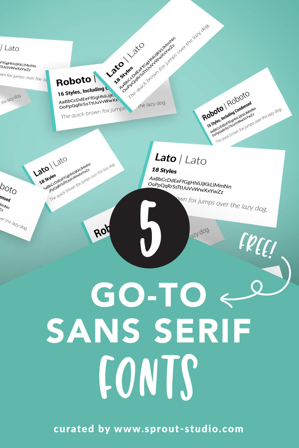
Our Favorite Go-To Sans Serif Fonts
It’s hard to believe I haven’t had a blog post about FONTS yet! It’s basically impossible for you to go about your day without looking at fonts. They are all around you, even for those non-designers out there! Well, maybe not last week when I was literally stuck in bed with the worst flu of my life. 🤔 But even then, there was text on my medication that I was taking… so I guess even when you’re sick you’re consuming type in some way.
There’s an insane number of fonts out there. Since there’s a lot of poorly designed options, we wanted to give you a hand. We thought we’d share our go-to san serif fonts that you’ll often find us using/suggesting with our clients. These typefaces might seem simple, but there’s a lot of power in simplicity. These subtle beauties would be great paired with a display font or your brand logo.
Roboto: A Versatile & Accessible Font

What we love about Roboto is how it works with just about every project (not that we actually use it that much, but we could). One of my favorite things about this typeface is that it comes with a Condensed Font. This means it’s a skinnier option and allows you to fit more letters on one line. Roboto is like my modern (and free!) version of Helvetica — beautiful and timeless.
–
Open Sans: A Powerfully Simple Font

Similar to Roboto, Open Sans is another great option that can be paired with just about anything. While still very clean and simple, it has a little bit of whimsy. It comes with 10 styles which really gives you a lot of flexibility.
–
Lato: A Sans Font with Character

Lato may be one of my favorite fonts because of the subtle character within the characters. 😉 When used in body copy, it’s a little tricky to see the nuances of the letterforms. However, if you have the opportunity for larger text, you can see that the corners are curved and show little modifications.
–
Montserrat: A Modest Modern Font

Montserrat has a modern feel with the very circular forms, such as the O, C, G, and Q. Because of this, the font appears wider than other typefaces. When that O becomes more of a perfect circle and less of an oval, your overall width will reflect accordingly. With the most styles on our list, Montserrat is very versatile, just keep in mind your text will spread across more space. Sometimes this can be good and work in our favor, sometimes it’s not. (Sidenote: Think back to when you were in school and you had to use size 12 font, and it had to be 4 pages long. This would be the font you’d choose to get away with writing less, lol.)
–
Raleway: A Quirky Yet Clean Font

Last but not least, we bring you a very popular font among many. Raleway is known for its quirkiness but still comes across very clean. What makes it quirky? 1. There’s little curls on the tails of the a and d. 2. The w’s are also very recognizable, which some may love and some may hate. 3. The letters are also a little goofy because they don’t follow along the same baseline. Again, some like that while others (like me) don’t.
Overall, I think that Raleway is a great font for businesses that want to be a little casual, yet still professional.
–
What do you think? Are these some fonts you’d be interested in trying?
Next time you’re wondering what to use as your brand font, give one of these a try. Best of all, they’re designer approved! AND FREE!


