
What is "White Space" and why should we use it?
What the hell is white space and why do I need it?
What a great question… Designers loooooooooove white space — for real!
But what if you’re not a designer and you have no clue what we’re talking about?
We’re here to tell you all about what it is and why you should follow along with this classic trend… Well actually, it’s not really a trend, it’s simply just good design.
To begin, let’s define what “white space” means in the visual world.
White space is referred to all the blank space between the text and imagery. Commonly, also referred to as negative space, it can span from the large spaces of white to the teeny tiny spaces between letters. Now, the term is referred to as “white space”, but keep in mind this doesn’t necessarily mean that it’s white in color. The open and blank spaces are what we’re referring to… whether they are stark white or our favorite Pantone 563 CP. (to learn what Pantones are, click here)
Does that make sense? This white space is essential. Using space around your elements allows it space to breathe. In addition, using a lot or a little white space, can help balance out a design or assist to draw attention to certain elements.
3 Key Benefits of White Space
–
Space to breathe.
I good design, you want me make sure you give all your elements room to breathe. You don’t want to stack everything on top on one another and cramp the page. It’s like living downtown and practically being able to reach your hand out the window and touch your neighbor. That’s so not cool. Graphic design is the same. It’s important especially with logos to have space around your logo, many designers refer to that as “Sacred Space”. (If you’re interested in more we talk about this in our “what is a brand guideline and why should I have one” post.)
Balance.
We like to talk about balance all the time with our clients. It’s a HUGE part of design and it is something that separates good and bad design. Have you ever looked at something and it just seems off? That could be due to the balance of white space. (Granted, sometimes designers will intentionally throw you off. Sometimes that is the objective, but please leave this to the masters…) A lot of times when designs get overcrowded with content, this tends to take away from the balance and everything just looks cluttered.
Drawing attention.
Using a lot of white space is great for drawing people’s attention. Imagine you’re walking down State Street in Madison, WI and you are seeing all these posters for events, sales, fundraisers, etc. coming up. We’ve all seen these public boards where they are plastered with promotions. Using a large amount of white space can grab someone’s attention because it’s so different from everything else. You think to yourself. What’s this, and ass you get closer, you see a beautiful design that’s taken advantage of the blank space your eye needs.
Let’s look at some samples of White Space.
Nice white space can be seen in this promotion by Fakeson found on this article.

We’re so in love with the talent from DKNG and this poster for REGGIE Watts is a great example of white space. (it’s also is an amazing design/illustration in general)

Another great sample is this business card design for Miya Hirabayash. We love how she kept the whole top half open and it really gives the logo space to breathe.

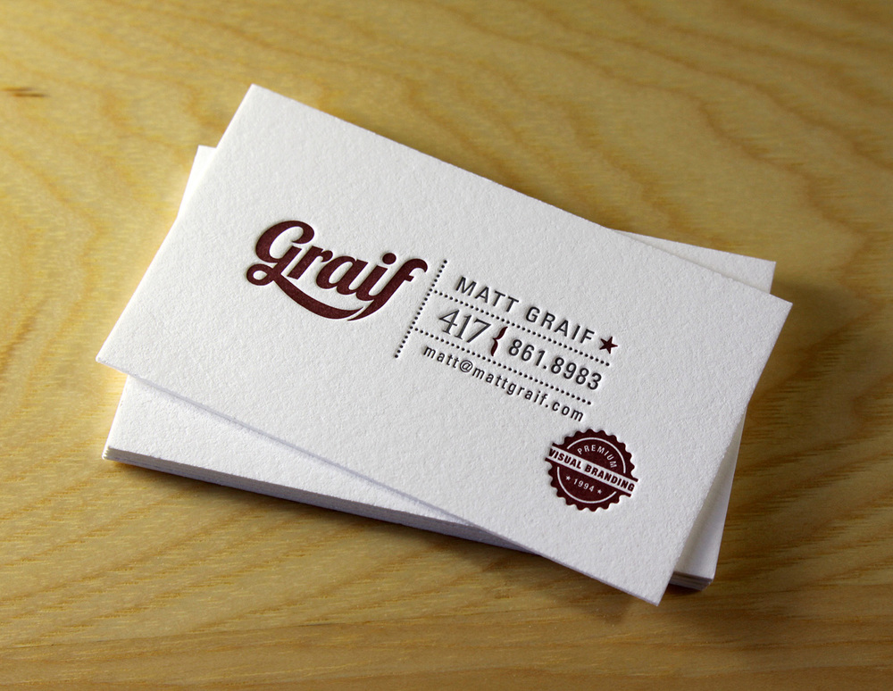
Business cards are a really great place to look if you want to see how well someone uses their whitespace. Matt Graif did a great job with these cards.
Packaging is another area of design where white space can be used really well (and unfortunately, also very poorly). Purelosophy has a great way of using minimalism and white space.

Lack of white space:
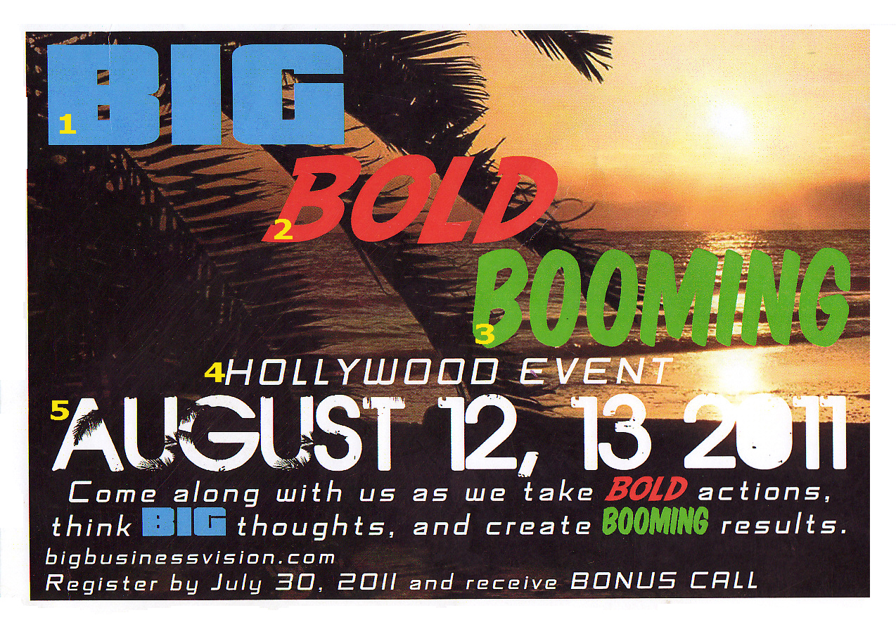
Here’s a good example of bad white space (not to mention too many fonts!!), but here you can really feel a difference.
Here’s some samples of “Mailer Design” (whatever that is?), that does not have a good use of white space. Almost every inch of space is covered but an image or text…

So, have you learned anything?
HOPEFULLY.
We hope the most important take away is to not overcrowd your designs. If you’re a designer, keep this in mind while you design. If you’re a client, be sure to let your designers make conscious choices with the white space… You don’t need to say, “Make the logo bigger.”


Leave a Reply
Want to join the discussion?Feel free to contribute!